24/02/2010
Project: Anti-Bullying Campaign
From my research I found that images are not always the best way to get the message across to my target audience. I decided to focus on how many people speak out against bullying to try and get others to do the same. The flip chart idea came to mind when I was researching Margaret Calvert's font for signs and thought about the older versions of train information boards. I am in the process of making an animation for this that could feature on tv for example.
The front and back of a flyer that I kept in the same design so people can make instant recognition.
The wristband that would be given out in public and at schools during Anti-Bullying week, aswell as other times in the year.
Project: Colour
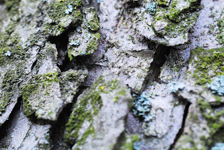
My photography project was based on colour. I focused on nature around me and took a variety of images that I felt showed of how colour changes the perception of the image and object.
Project: BBC event poster
I was inspired by the bauhaus movement for this poster along with Roy Lichtenstein's sunset painting.

I came up with some ideas that I felt would attract my target audience.
I developed the mouth and sun idea further but decided against the mouth as it was more appropriate for a younger audience.
We had set guidelines which included the font. The verdict during a group critique was a poster that would attract all ages and would be suitable for the BBC.
Project: Signs
I first researched into other designers that had created signs to get a general knowledge to information such as the leading and tracking.
I started of with incorporating signs into the sign, sign and directions into the directions sign but making them not discreet. After a group critique I changed my first designs so they were not poster like. By striping away some unnecessary backgrounds I created a clear sign.
Project: Packaging
I decided I would create packaging for a children's clothing company called no added sugar. I started looking at different types of nets to find one that would be cost effective to make for the company and interesting.
From my research I discovered that the packaging needs to be of a high standard to influence people to buy the
product to build customer relations and get more
customers to shop with the brand.
I decided the net above was not that exciting and decided that an octagon shape would be more attractive. There are two flaps at the top. The one below will have the logo in 3D which will secure the two flaps together. I may still have a similar design as people liked the design.
Project: CMYK
I came across this poster on cornwell designs. I like how the poster has been laid out and the use of paint to make it more attractive.
I wanted a clear and vibrant poster. The first design I created feels as though it lacks something.
I focused on the main message which was cmyk gets layered which became a slogan to the poster. Using lines to show the overlapping process I thought was a good idea, however you would not clearly see that cyan is overlapped on yellow unless you knew, which many may not.
I thought about a simple way still sung lines and I feel the information is clear and presented in a way that people will be intrigued into what the poster is about.
Project: Personal reflection. Create a poster of your interest. 3D glasses needed.
For my first project at college I decided I wanted to create a movie poster. I came across a photographer during research for my photography lesson, who created 3D images. I really liked this idea and started experimenting, which I soon found was not as easy as I thought.
The top two images are from Brian Loube's website which influenced me into creating a poster in this style.
I then started experimenting with images of the internet that I felt would look interesting in 3D. The batman did not work so well as the image looks as though its inwards not out.
I really liked the water being in 3D as it looked more dramatic.
I decided to focus on a superhero theme and got some friends to dress up as superheroes. By making just the characters stand out I feel the poster is much more attractive providing the viewer is wearing the correct glasses.
Project: Abstract
I had ideas about taking images of the things people may see everyday and making them abstract.
Below are the yellow lines of a road.
I then thought about natural stuff in my environment and made a collage of objects from newspaper to glass. Some images work better than other.
Project: Structures
I started of looking at the skeleton. I created some pastel images aswell as outline images. I feel the outline drawing makes the articulated structure of the rib cage stand out more.
I then started thinking about other structures which led me to architecture and blueprints.
I then started creating my own blueprints using screen prints which created some nice effects. I am in the progress of turing some of these prints into business cards for another project.
Project: Mixed media
I created this painting for bullying before I decided I would do it type based. Created on wood using gouache paint.
This started as a still life. I thought about mixing it up and then
using crayons and chalk I filled in some of the gaps so your eyes
would fit parts together themselves.
Subscribe to:
Comments (Atom)


